![]()
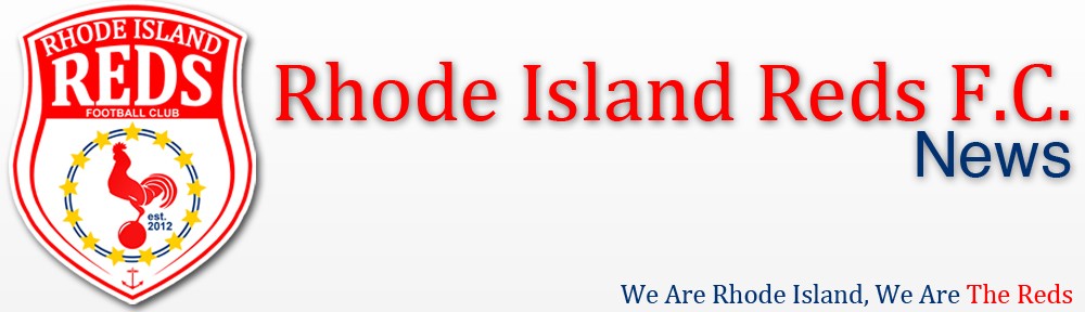
We have listend to your feedback for the past couple of years and with a lot planned for the 2014 season we have decided to revamp the club. One big thing that people were asking for was a new logo with a much simpler design and one that embodies Rhode Island. We think that we have done a stand up job at incorporating all of your suggestions.
The Rhode Island flag features two major things that you will now find in the new RI Reds crest. 1) 13 gold stars to mark Rhode Island being part of the 13 original colonies and 2) the anchor which symbolizes hope. Along with the stars and anchor you will also notice the Rhode Island Red in the center of the crest clutching a ball. For those of you that do not know, the Rhode Island Red is the official state bird. The colors that are used for the new crest are Red (the official club color), Gold and Blue (The official colors of the RI flag).
We are looking forward to a big 2014 and we hope that you all enjoy the new crest and help us to make the Reds, Rhode Islands number one soccer club.
– We Are Rhode Island, We Are The Reds

Looks great. Well done.
Perfect. Look forward to a great season.